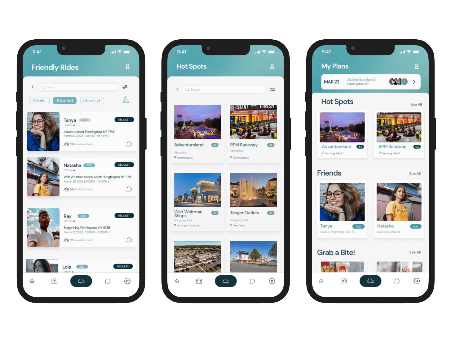
A tool designed to help college students that attend Farmingdale State College discover affordable attractions nearby while on a budget and increase the development of relationships.
Timeline
Team Members
Role
Tools
Spot! Navigation
Research
Ideation
Design process
research - interview Purpose
dorm student
commuter - public transit
COMMUTER WITH A VEHICLE

research - data overview
Survey Key
Neutral
Agree
Disagree
Strongly Agree
Strongly Disagree
39.1%
26.1%
30.4%
Issues with Friend Availability occurs when making plans
26.1%
30.4%
17.4%
21.7%
I am aware of affordable places to visit near my dorm

research - data overview
Survey Data - Commuter Students | 31/66 Students
After analyzing all of our data we decided to focus on our main audience being dorm students and commuters with a car. This decision was based on the insight that commuters using public transit shared similar challenges with dorm students, particularly a lack of awareness about nearby attractions.
39.1%
26.1%
30.4%
I am friends with Dorm Students
11
35.5%
8
25.8%
6
19.4%
4
12.9%
I know about affordable and fun places on Long Island
Survey Key
Neutral
Agree
Disagree
Strongly Agree
Strongly Disagree
RESEARCH
Problems students encountered
RESEARCH
What we discovered from gathering this information from students:
RESEARCH
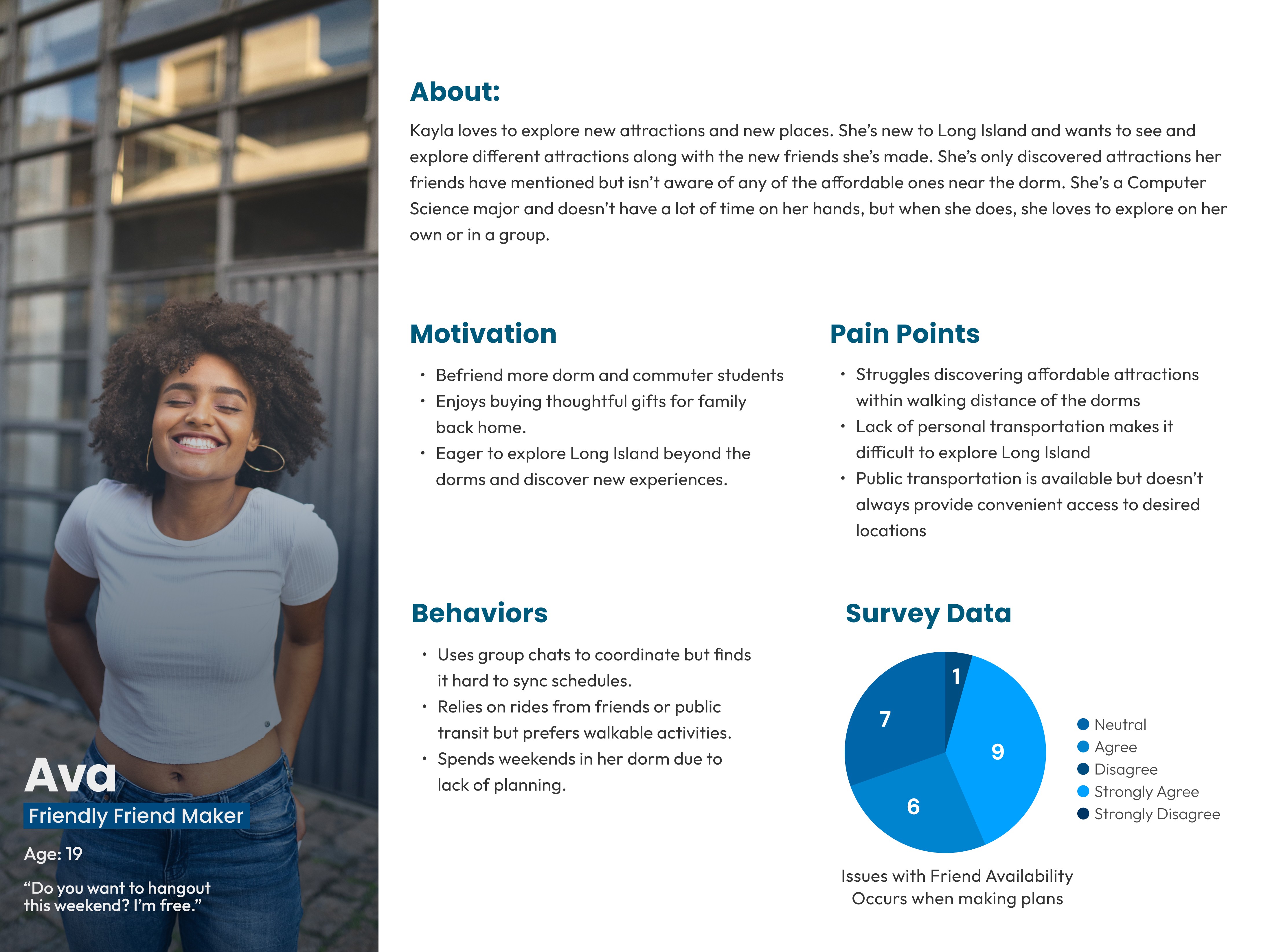
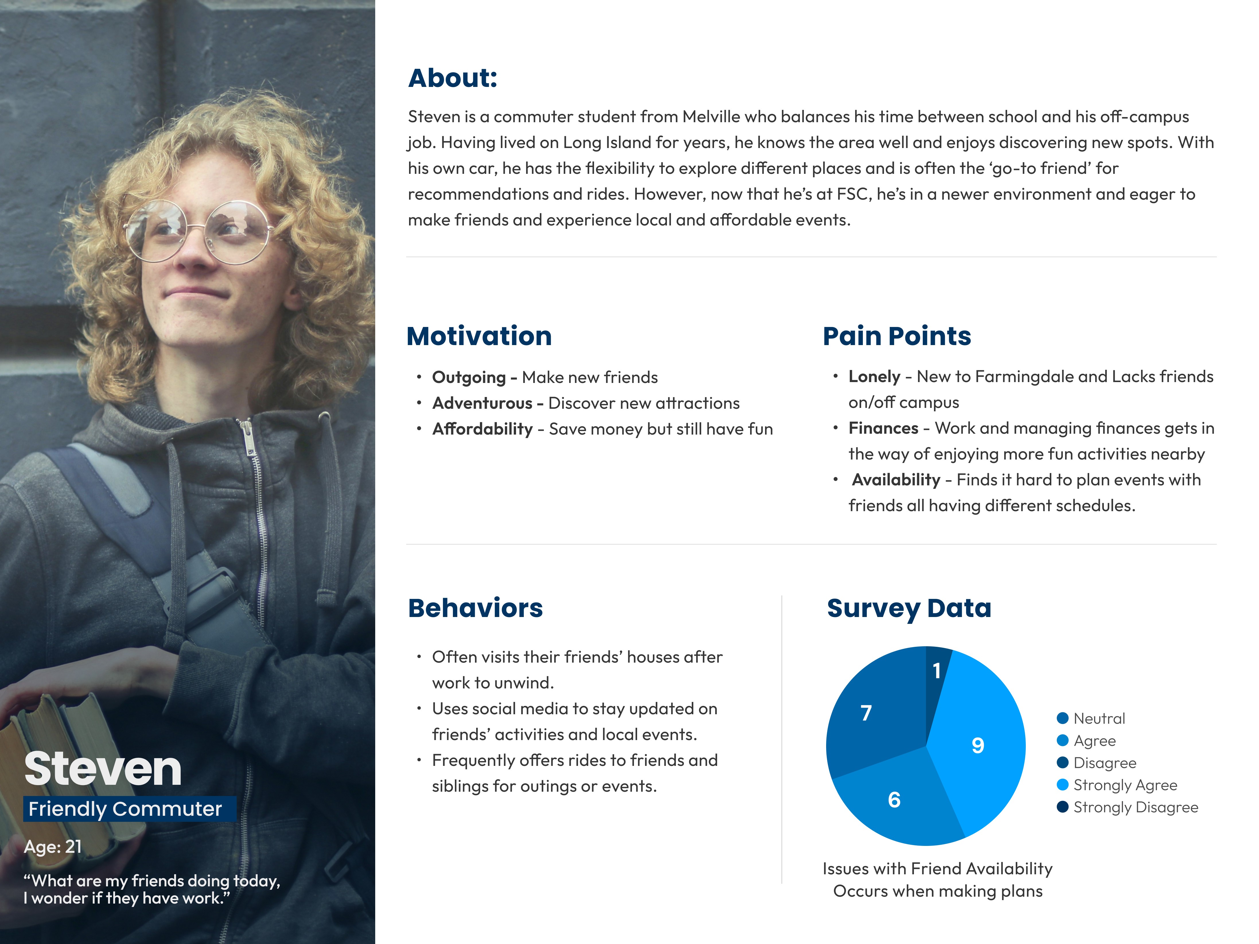
Understanding our key users, and creating our personas
After conducting surveys and interviews we discovered who are three top personas would be. But during our second iteration of Spot! We heavily focused on Commuter Students and Residential Students. We saw students that utilized public transportation had similarities between the two.
ideation - developing the first solution
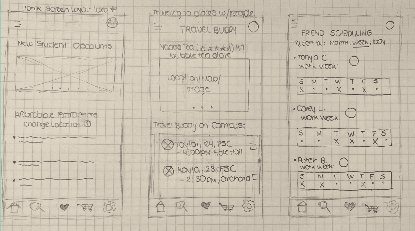
Creating Sketches & Forming Solutions
With these sketches, my first solution was to create an application users can access and utilize quick and easily. The complex part was discovering what features would be included.
Application Features:
Have affordable attractions displayed each week or day
Student Discounts available nearby or a section to make friends with other people who dorm or commute to campus
Scheduling Section for friend availability
Section where students are traveling to places and can offer to take people there
Increase friendships with one another
Ex: getting boba, offering rides
Confirm they’re a student at FSC (RAM ID, Name, Year, Major etc.)
ideation - developing the first solution
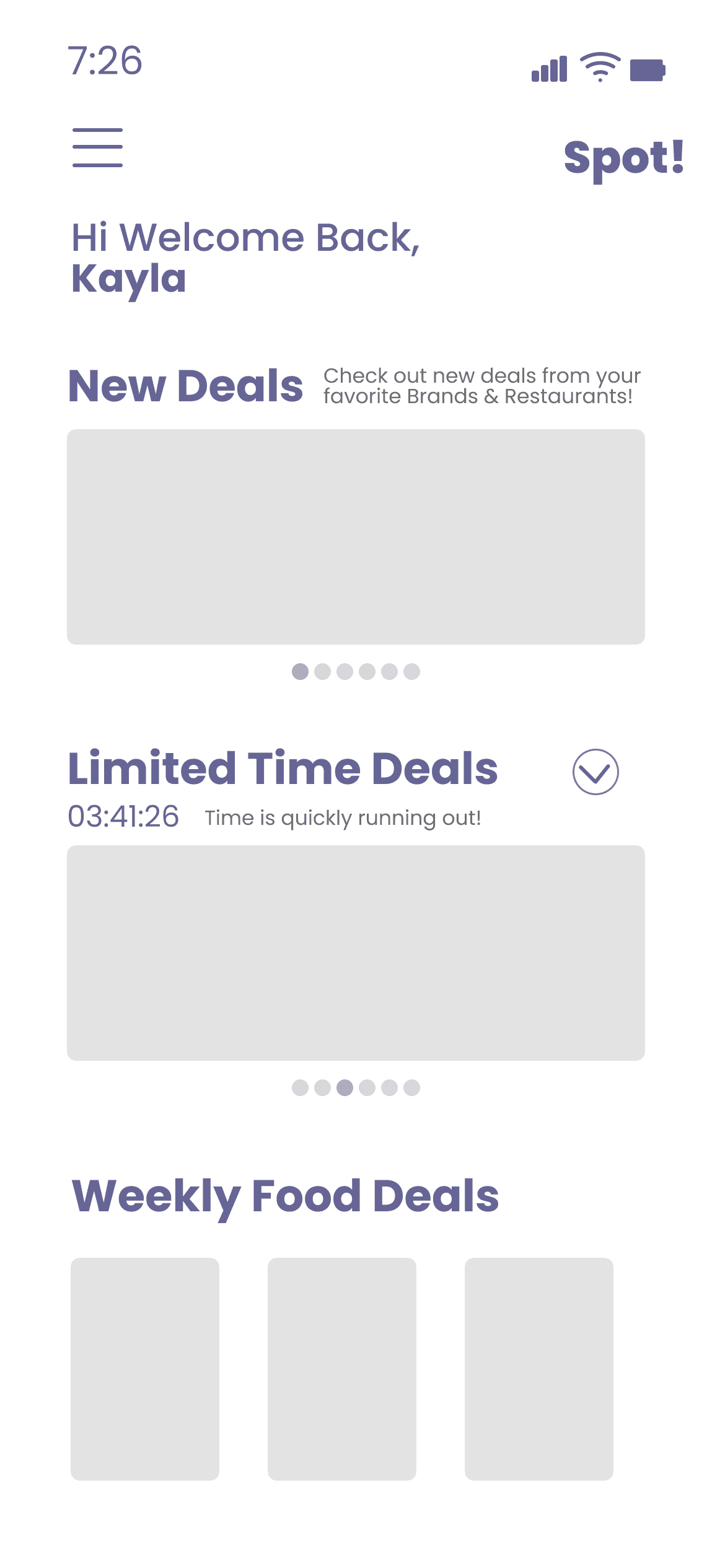
Creating Grayscale Wireframes
In the initial stages, we both created compositions to visualize our early ideas for the application. However, in our second semester, we refined and iterated on our designs significantly.
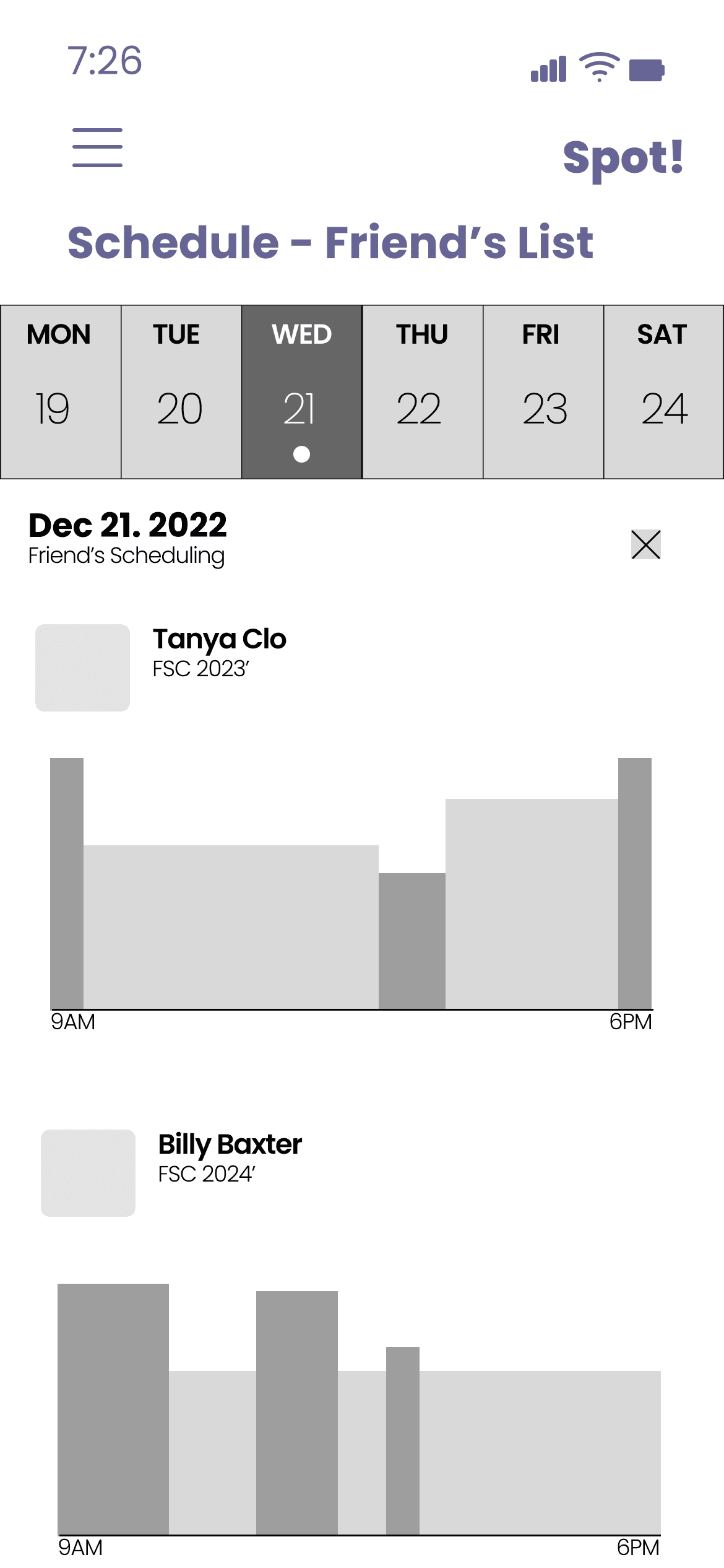
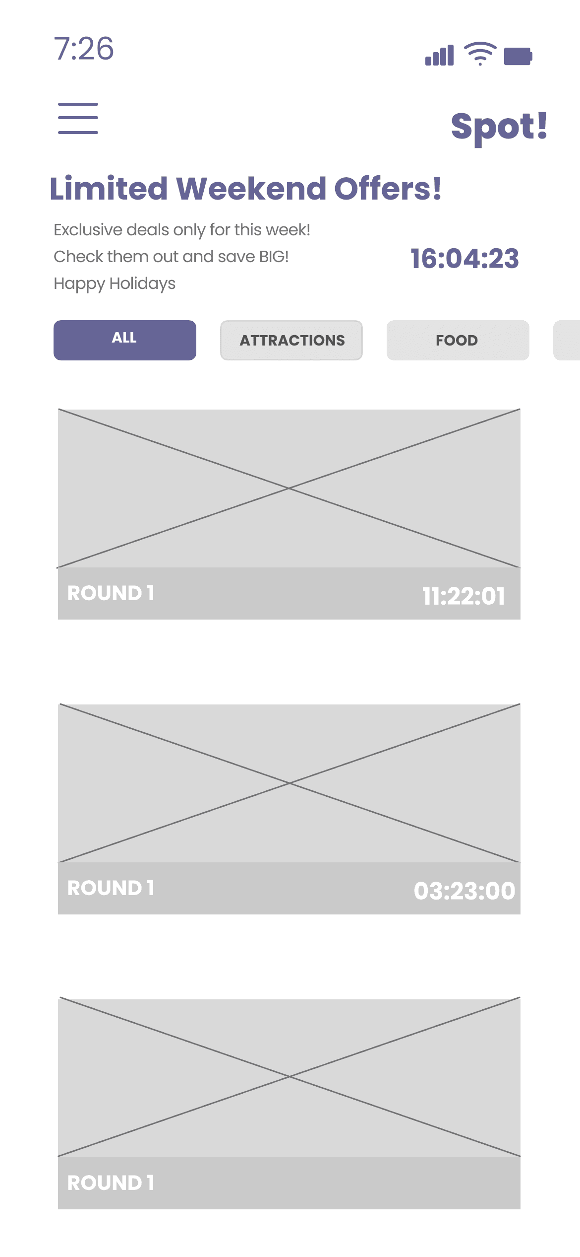
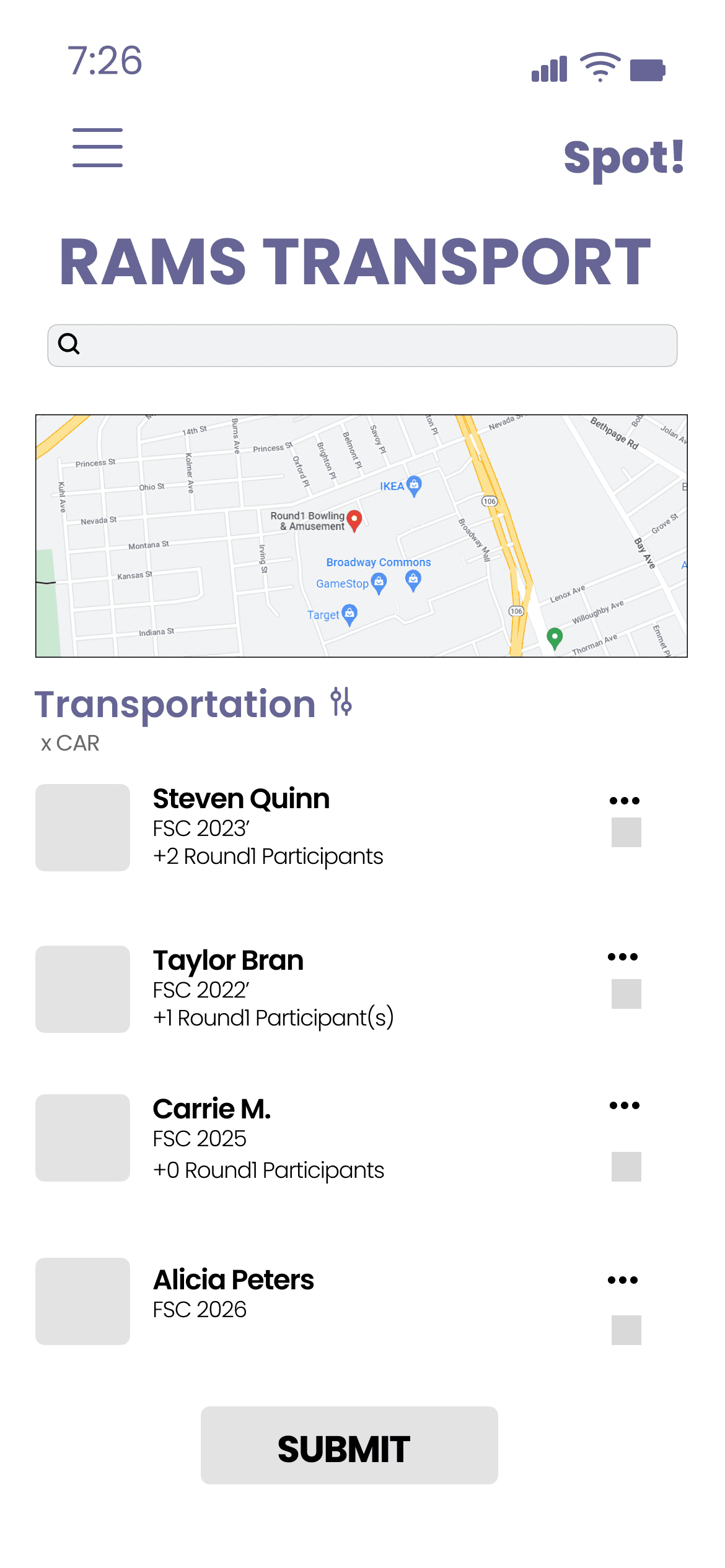
During the first semester, we developed initial concepts of the app’s interface, which we later transformed into mid-fidelity wireframes as the project evolved.
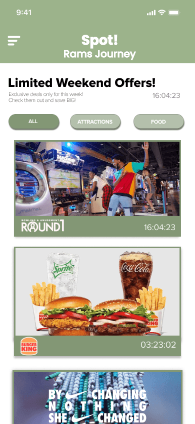
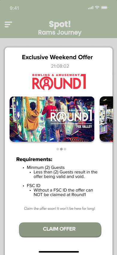
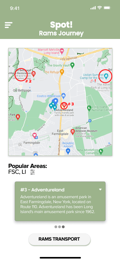
Below showcased the Home Screen, Friend's Schedule, Limited Offers, and Rams Transport a way for students to offer rides for others also going to the same attraction as them.
ideation - developing the first solution
Designing Mid-Fidelity Wireframes
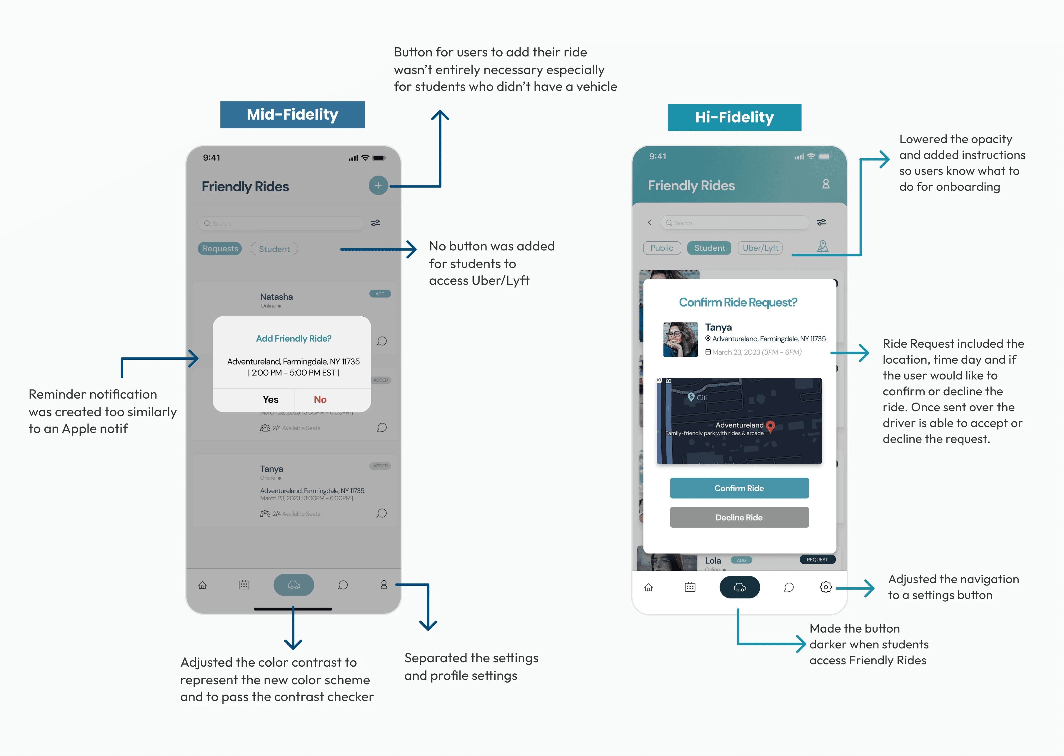
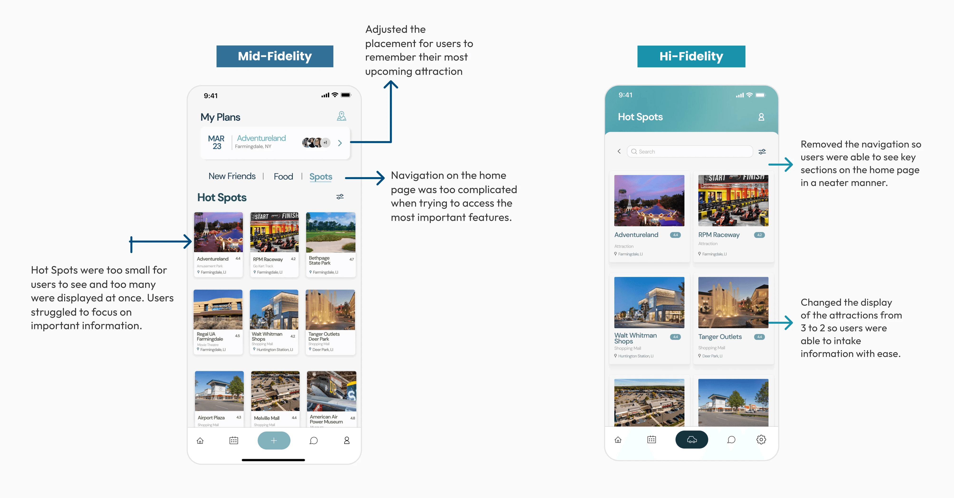
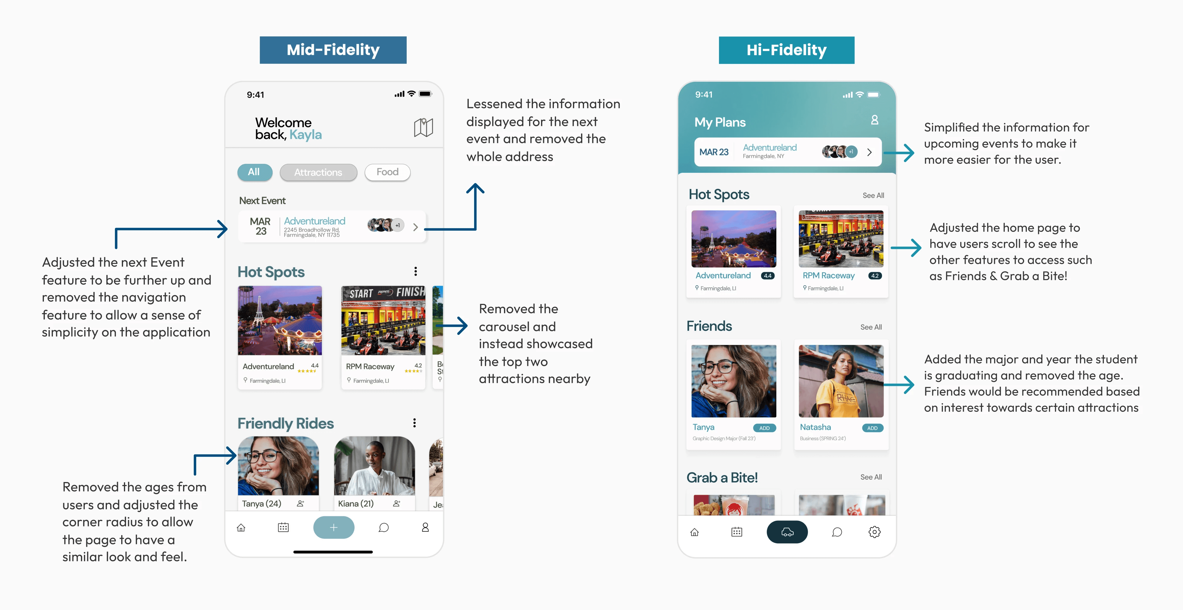
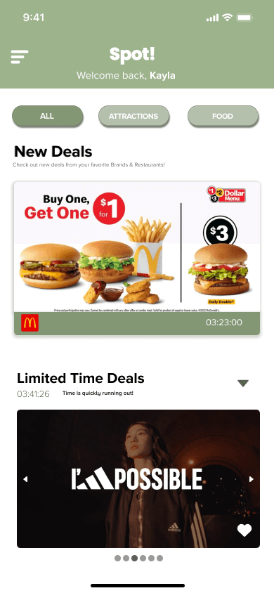
Our first Mid-Fidelity wireframes were not our strongest. We were able to present our designs to the class and received feedback in regards to the colors chosen and the overall look and feel of the app. We focused heavily on what students would look for.
ideation - developing the first solution
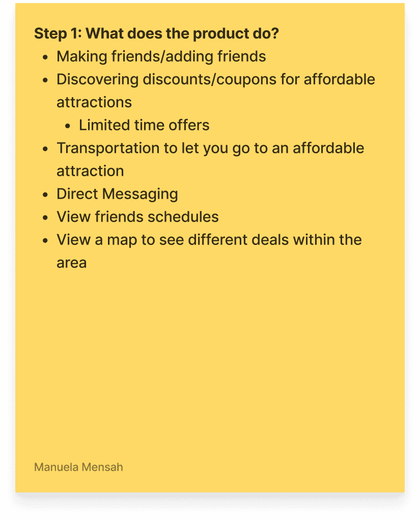
Spot! the thought process on utilizing the application
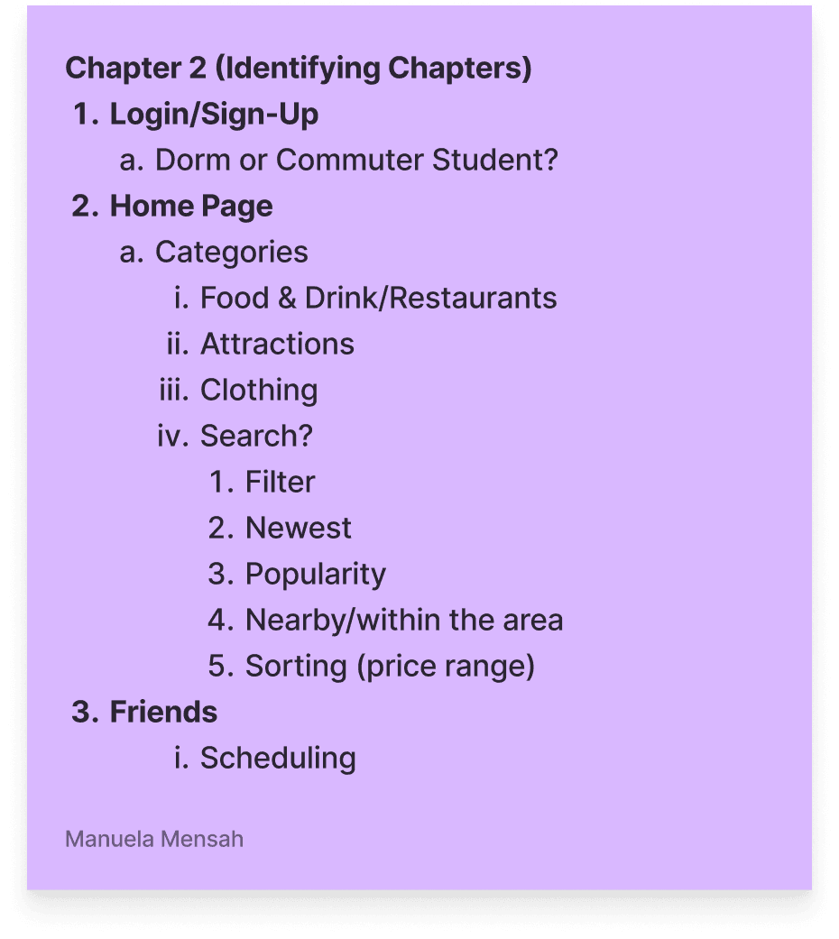
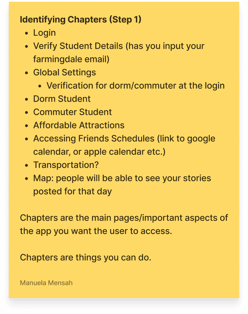
During this portion of the project we both created our own chapters to showcase different experiences for dorm students and commuters. As stated before I focused on how dorm students would utilize this application.
ideation - developing the first solution
Creating the Information Architecture
The information architecture showcased the most important and visible sections within the dashboard and the features a user would come across when utilizing the application. They're able to access different modes of transportation, access the map to see hotspot features and even a calendar to view their friends schedules.
Design process - User Flow
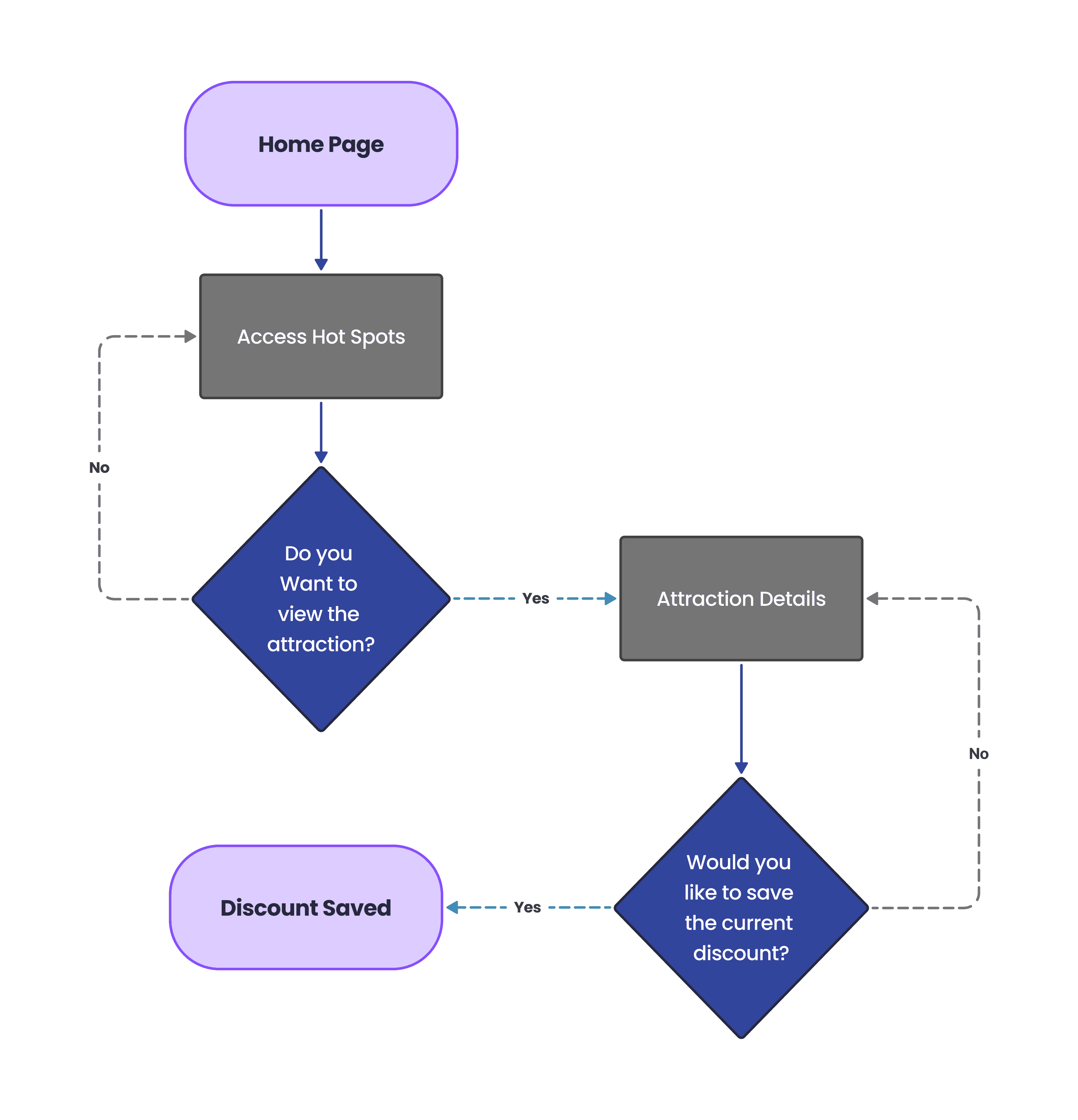
How to save an offer:
Users are able to access popular hot spots from the home screen and can check out more attractions when they click See All. From there the user is able to view whichever attraction and save a discount that they feel is relevant towards their needs.
Design process - Sketches
Re-designing our sketches
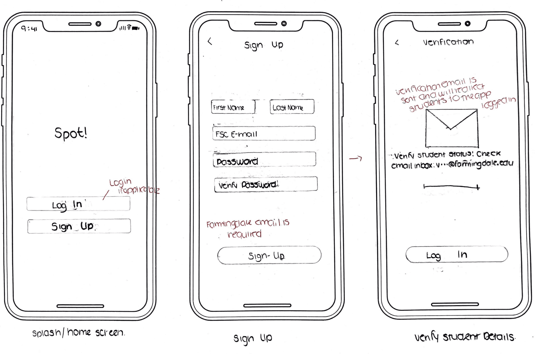
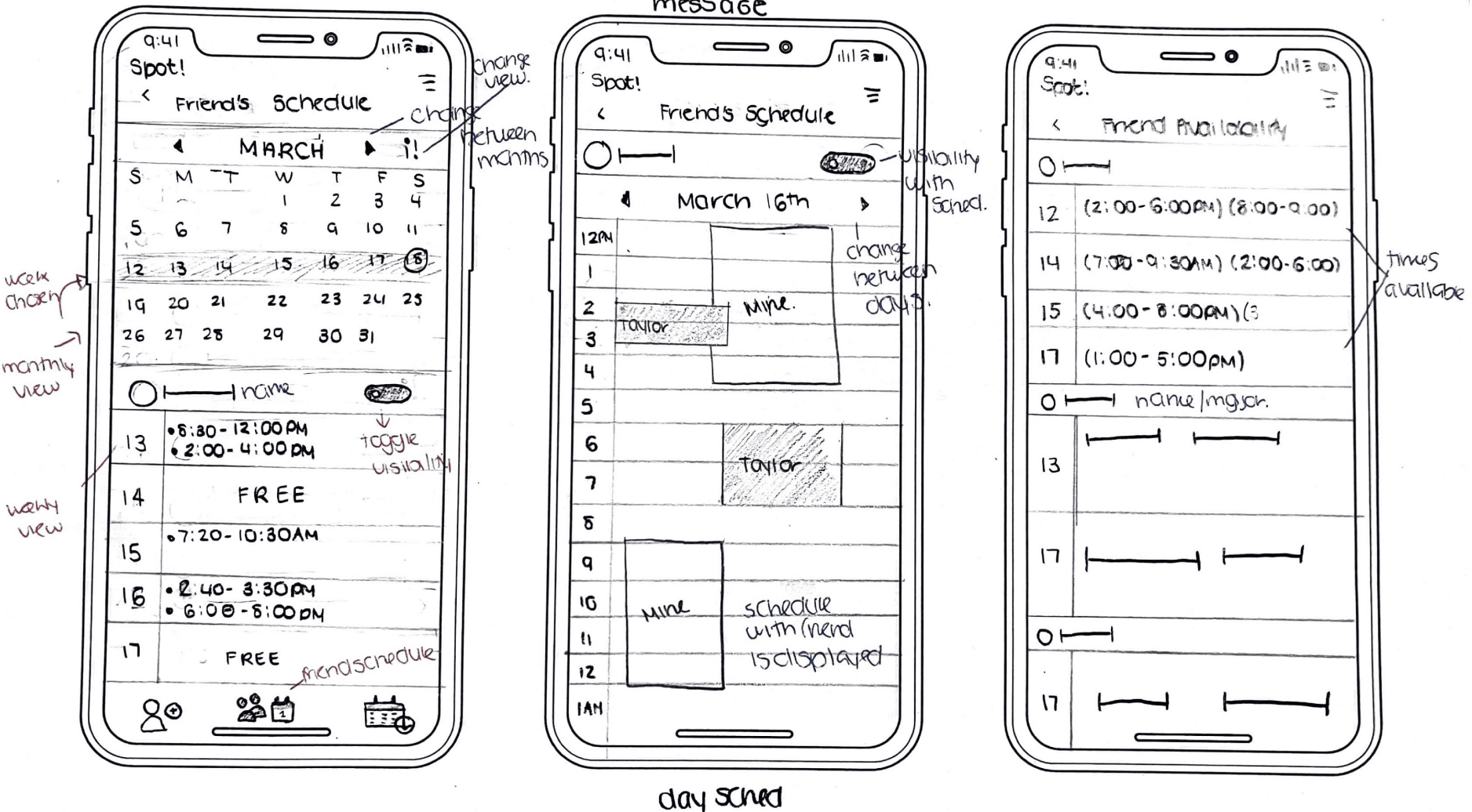
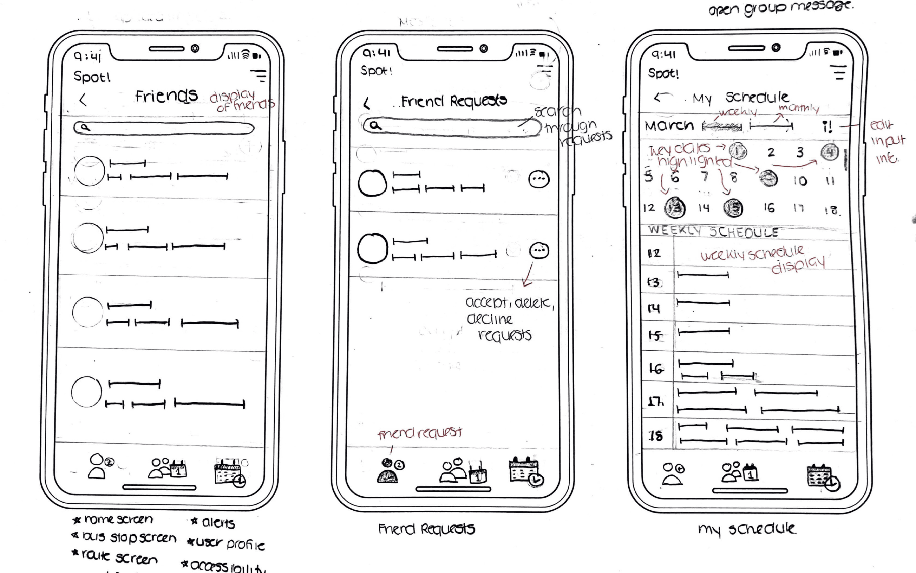
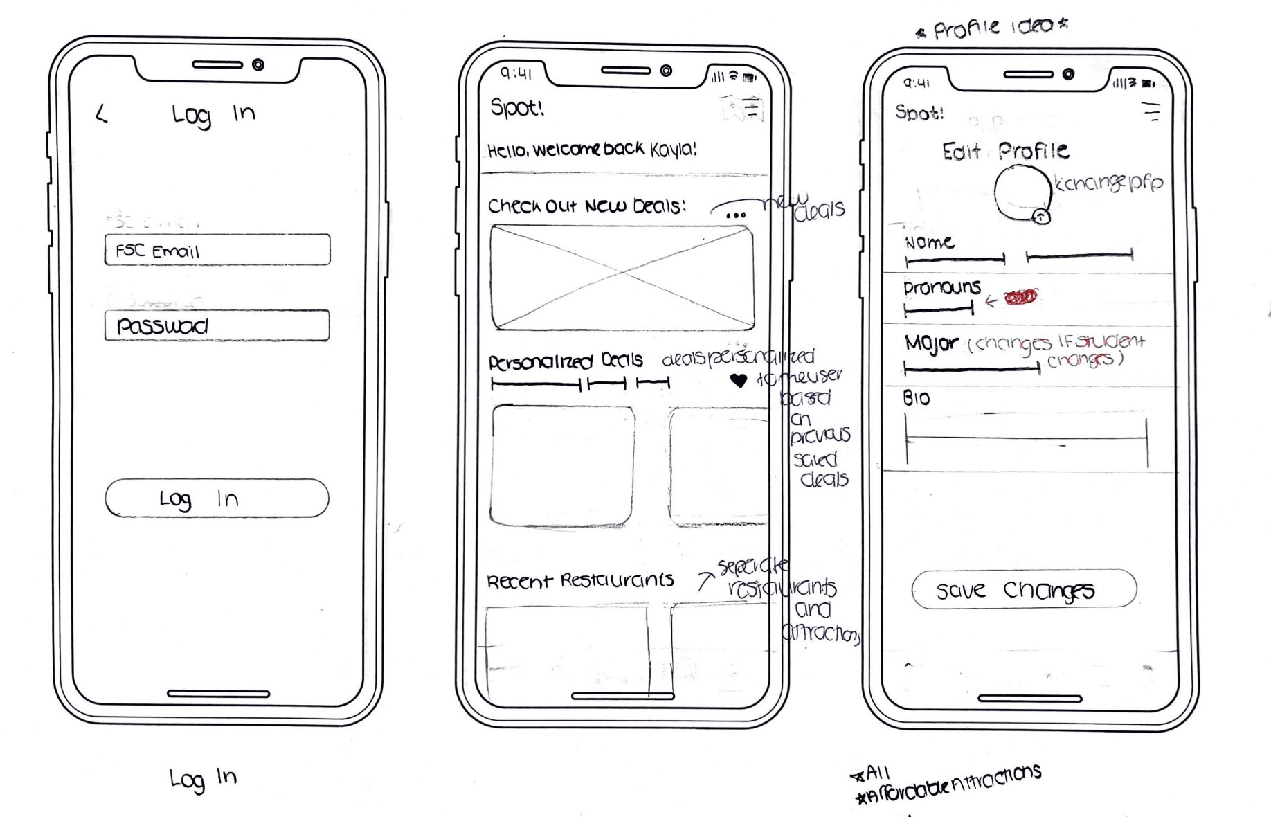
Before moving on to high-fidelity designs, Jake and I created various sketches to explore different user experiences within Spot. Below are sketches for key screens, including Sign-In, Viewing Calendars, Friend Requests, Profile, and Home Screens.
Iteration & feedback
Transforming our Mid Fidelity → Hi Fidelity Wireframe + Feedback